BEWAG and BEGAS had long traditions of supplying energy in the Austrian state of Burgenland. The two large-sized suppliers merged in July 2012 to form Energie Burgenland AG. The new company has nearly 850 employees and is thus a major employer and a high-powered engine of growth of the state’s business community. The merger of the two companies represents a milestone in the economic and political history of Burgenland. The leading role played by the company in “green energy” has been helping Burgenland achieve energy self-sufficiency.
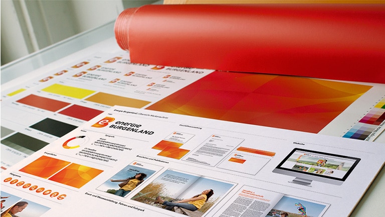
The core brand and strategy of Energie Burgenland was conceived by marketmind. This formed the basis of the commission granted to Spirit Design in April 2012 for the development of the company’s entire brand design. This especially comprised all elements and applications of the brand, the communication of the brand, the formulation of the looks of the exterior of buildings and of the designs of the customer center, and the facilitation of the implementation.
Brand Launch
Together under a brand
The merger of two traditional companies, each with long traditions, and the creation of a brand uniting them represented a major challenge. The new brand expresses the mastering of this challenge by having the courage to employ a new language of design. It conveys a positive view of the future. Energie Burgenland is a brand with the strength to refer to the strategy whose implementation united two companies, each with a culture created in the course of more than 50 years of successfully writing energy supply history.
The new branding documents to the outside world the merger of two areas of business, forming a new company in the process. The design has produced a brand that is likeable and energetic. It thus conveys the company’s positioning on its market. The design also conveys the brand’s accessibility and trustworthiness, and sets up a dialogue between the two founding companies, each strongly solvent and robust, and now joined together. The branding makes this teaming up apparent to employees and customers. This branding is to be experienced at the points of brand contact.
Innovative Brand Design
An energetic approach to the future
The liveliness of the innovative corporate design accentuates the newly-formed company’s traditions and modernity. The shape of the “B” emphasizes the brand’s roots in its region. The yellow and red colors of the trademark refer to the official colors of the state and of the companies that merged. They are thus a reference to the origins of Energie Burgenland. The integral and brightly-shining “e” and the brightly colored patches of energy in the logo reveal, at the same time, the company’s dynamism and energy.
An algorithm was employed to generate from the logo the “energy patches”. The patches serve as a flexible-use key visual. It, in turn, shapes EB’s image. This flexibility manifests itself in the personal “energy patch” gracing the business card of each employee. This flexibility also shows itself in the individualized configuration of walls in buildings.
The mix of typographies reflects the interaction between continuity and innovation and the melding of two cultures into a harmonically-functioning entity. The pictogram has been derived from the form of the letter. Its white has been placed upon an energy patch.

The new brand was officially launched. An integration process and such tools as an extensive brand manual are now communicating it in-house and to the outside world. The manual documents all phases of the identity and the brand design. It thus facilitates the management of the contact points by the proponents of the branding. It also constitutes a clearly-articulated signal on Austria’s energy market.

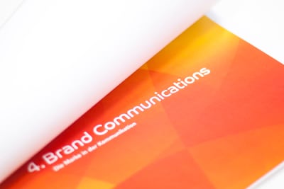
Brand Communication
Using all channels
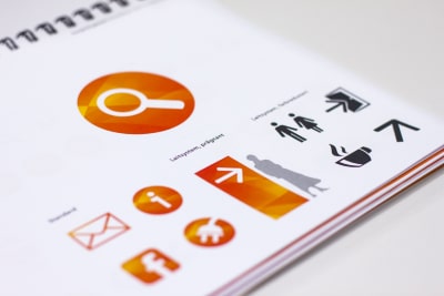
The brand design features highly detailed brand elements. These are to be seen in all of the means of communication of Energie Burgenland. Established were the pictorial style and basic layout to be used in all print materials, with these including information folders, and corporate presentations, magazines and employee newspapers. Also encompassed were all means of business communication – letterhead, business cards and much more. Spirit Design also defined pictograms and compiled all digital templates.
The branding’s communication manifests the traits of the state of Burgenland – individualism, pride, pragmatism, honesty and responsibility. It thus sets up an affinity with the state’s residents. It also indicates the the path to be jointly taken towards the energy supply and innovations of tomorrow.
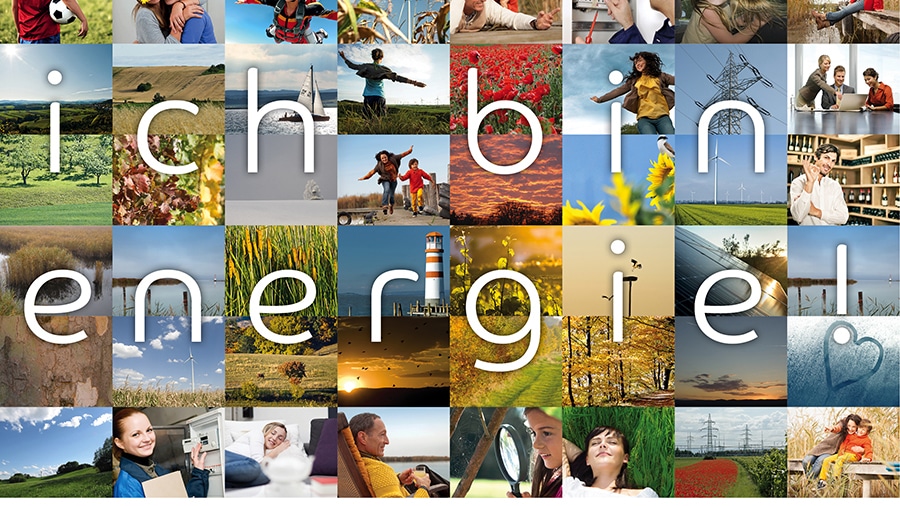
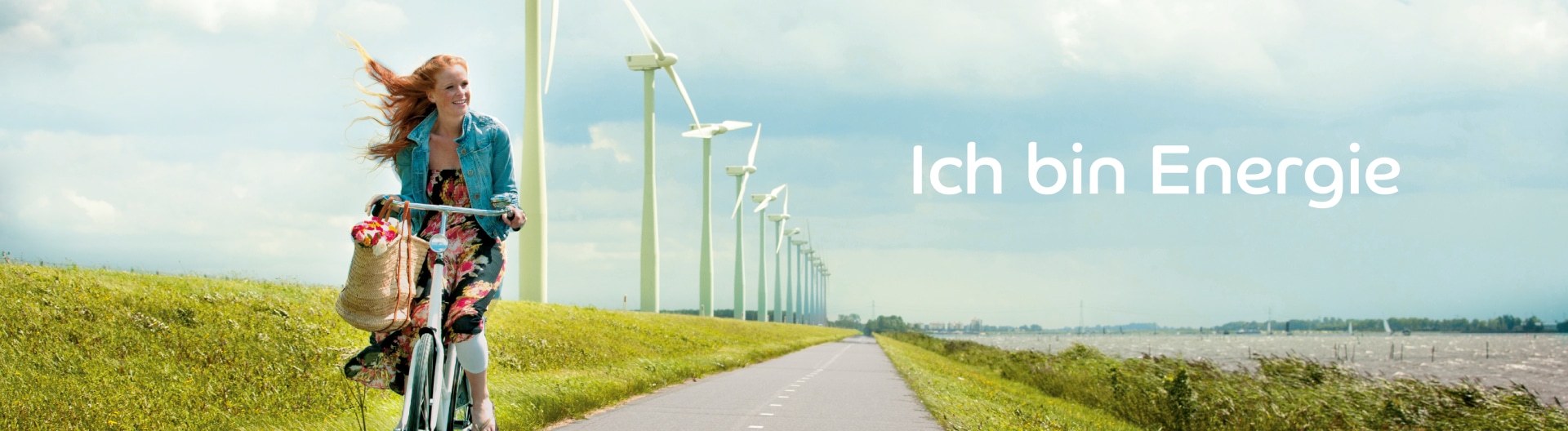
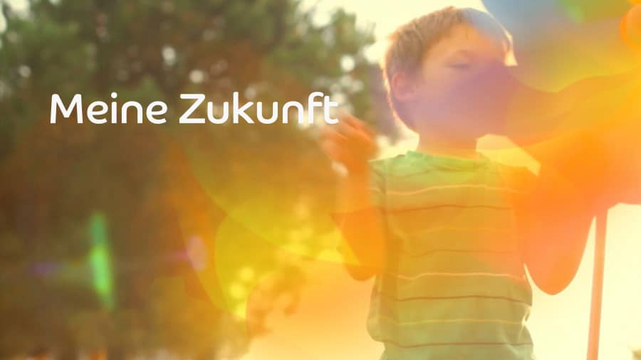
“I am energy!” – Centering on the customer
The emotional thrust of the new brand is thus centered upon human needs. It sets up a point of reference to customers’ daily lives, and emphasizes the value accruing to consumers from the merger. The individual branding elements symbolize the newly-defined values of the company.
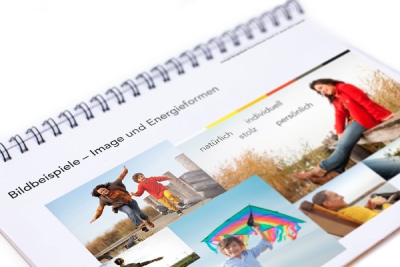
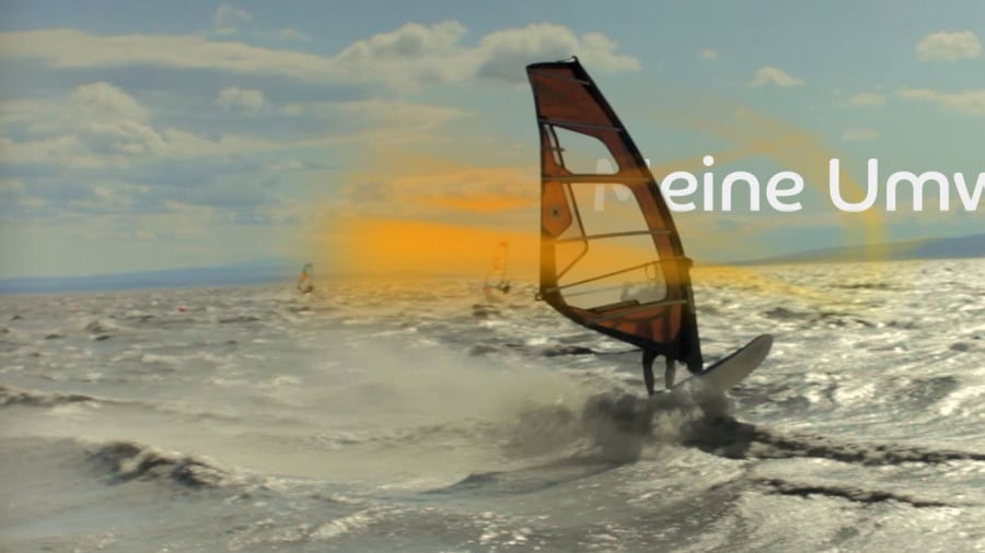
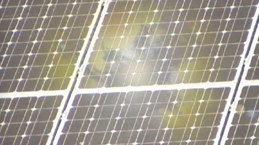
Its concept is based upon energy-imparting experiences. These are surrounded by the sources of energy – the elements of wind, sun, earth and water. The brand design is featured in all photographs-based products of Energie Burgenland. It thus forms an important building block of the company’s brand communication.
Its protagonists’ characters, appearances and ways of being manifest the core slogan of “I am energy!” The protagonists have been portrayed in the settings found in their homeland of Burgenland. The generous use of white imparts clarity, reliability and strength to the layout.

Digital Brand Experience

Digital staging – Online brand experience
The launching of Energie Burgenland’s branding was accompanied by a redesign and a joining of the extant Websites. The new branding design formed the basis of the layout of the Website. The new typography is also employed online. The visual language has also been digitally iterated. This was accompanied by the introduction of such new elements as the flexible gallery. The new Website of Energie Burgenland conveys the image of a likeable and energetic company. Viewed as a whole, the Website feels more free, open and friendly than those of its past counterparts. It enables the new branding design to also be experienced online.

On air design and motion graphics
Spirit Design also created film content for Energie Burgenland’s Website. This entailed employing the new brand design in the creation of film elements. The intro features animated energy patches. Also to be experienced are such further on-air elements as blurbs, fillers and extros.
Brand Architecture
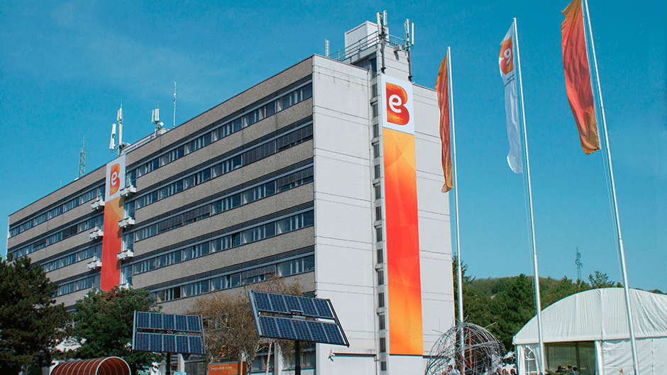
The new branding of Energie Burgenland is also being experientially conveyed to customers and employees by corporate architecture and by the company’s fleet. They promote the employees’ identification with the newly-positioned company and allow its values to become palpable to customers. They thus form a key component of the new world of branding.
The exterior looks and interior designs indicate that Energie Burgenland is a strong and reliable partner, one supplying a comprehensive range of energy-related services to its customers.
On-site dialogues with customers
Energie Burgenland’s customer services centers are also receiving external makeovers. Its revamping comprises the incorporation of an innovative branding design, and will be set forth in 2013. The centers also convey the brand’s messages. Their thoroughgoing design welcomes customers.
The attractive look of the customer centers fosters effects of recognition and on-site dialogues. It thus promotes the identification with the brand on the part of customers and employees.