
The Austrian model regions of electromobility are currently still pursuing independent design strategies with regard to infrastructure, services and guiding systems. Also the automotive industry is adopting different approaches. Such a diversity of isolated applications confuses consumers and creates access barriers to electromobility offers.
In the course of the Austrian Climate and Energy Fund’s “E-Mobility Model Regions Call 2012”, we developed a strategy and design concept of uniform and consistent usability design to enhance both the appeal and use, resulting in higher acceptance. Consistent usability design will offer guidance within the electric traffic system, reduce system breakdowns, and facilitate multi-modal traffic use. Therefore, our funding project “User-Oriented E-Mobility through Consistent Usability Design” raises public awareness and boosts both popularity of and confidence in electromobility.
Strategy for an Austrian Overall Electromobility System
When consumers use electrically operated means of transportation, they wish for a simple yet pioneering and multi-modal overall system that offers the right means at any time. Needless to say, the first e-mobility pilot regions primarily focused on technical aspects and the development of services. Nationwide access and user friendliness, however, have not been sufficiently addresses yet.
One system for all
An attractive e-mobility portfolio depends on the cooperation of various stakeholders: each energy supplier, infrastructure provider, IT service contractor, automobile manufacturer, and model region uses different logos and solutions in their portfolio. Our project pursued the goal of developing an overall system that could be marketed both nationally and internationally for the benefit of all parties concerned. The result is not going to compete with individual offers but provides them with an umbrella concept and facilitates both access and use.
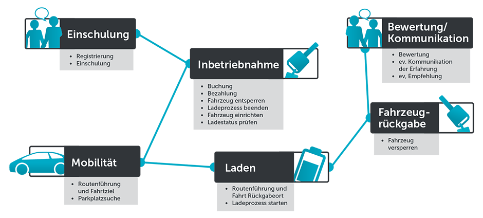
We have meticulously analysed the vision and strategy as well as portfolio and brand presence of existing model regions. Aside from a detailed user analysis, we also considered relevant competitors, benchmarks, and trends. In addition, we used mystery shopping and personal interviews to include the processes of purchase decision and use as well as user trip chaining to reveal potentials of improvement for each individual touchpoint.
Nationwide access and simple use
We defined the critical success factors and assessment criteria of a user-oriented usability design as follows: The integrated design of e-mobility offers focusing on barrier-free infrastructure and services, intermobility, and consistent signage, symbols and guiding systems.
Consistent Usability of Products and Services
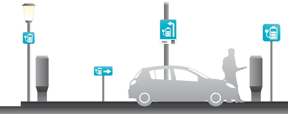
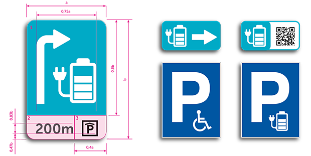
We have developed an integrated design language across all touchpoints and determined the different style elements at the product, service and brand level. In the context of e-mobility offers, we concentrated on consistent signage, uniform user logics, high recognition value, and international comprehensibility.
In terms of suitable brand architecture, we decided on the mega brand as our solution. The Austrian ATM sign served as a benchmark: it is of high recognition value and indicates payment and money withdrawal offers of a diverse range of banks and providers all over Austria. The new brand we have developed is not going to compete with any existing model region but provides them with a common and consistent umbrella brand.
Consistent and internationally comprehensible symbolism
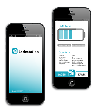
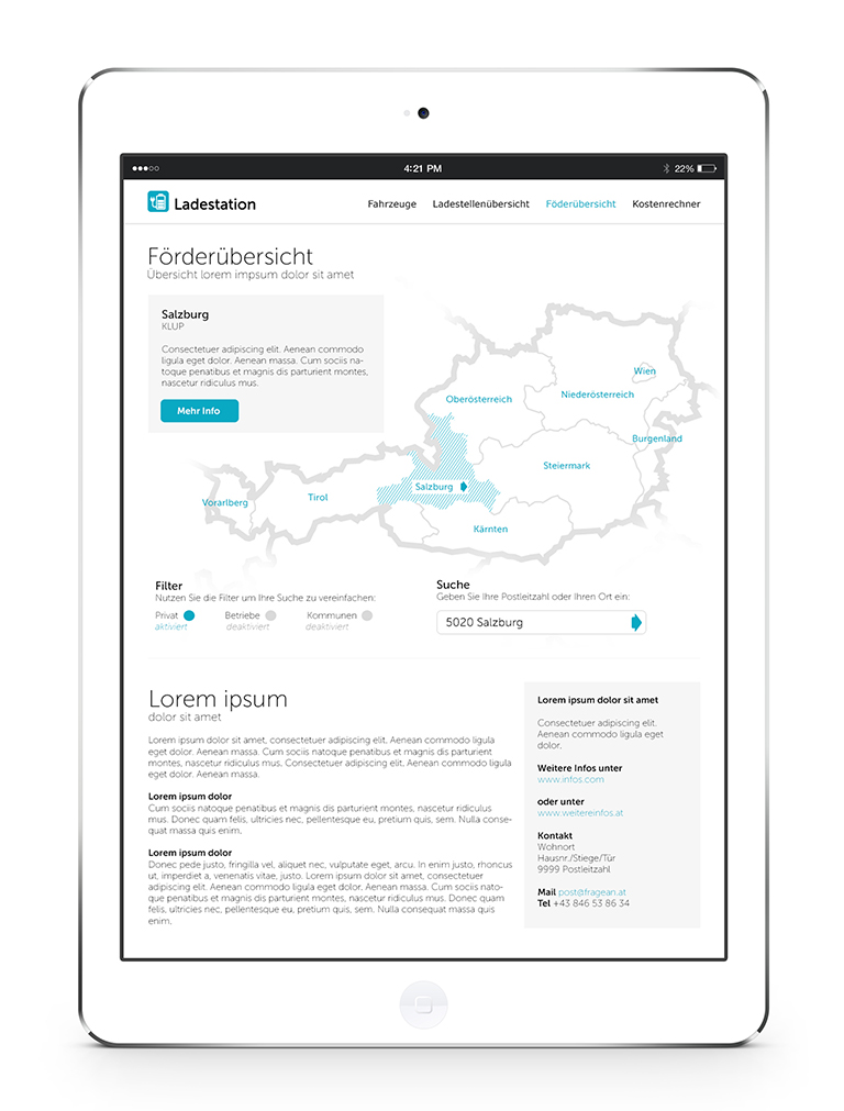
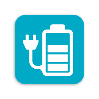
We deliberately chose the bold naming of “charging station” to save any additional advertisement budget for launching. While the catchy sign – a battery symbol and a plug – is based on the well-known icon for electric charging stations, its colours are clear, friendly yet flashy – in a fresh shade of blue that is associated with energy and sustainability. Logo applications have been visualised in various areas: guiding system, charging station finder via App, online platform etc.
Our project resulted in recommendations for a consistent design of e-mobility systems, a catalogue of measures for a concerted national implementation, schematic visualisations of selected system elements, and a conceptual manual for the signage of charging stations. This is how our approach provides an optimal foundation and sufficient potential for a uniform, consistent and user-friendly signage of charging stations and guiding systems – both for individual e-mobility model regions and nationwide.
User Acceptance Test
Online Survey of Target Group
We conducted an online survey of e-mobility enthusiasts to determine the acceptance of our consistent usability design. Two different logo concepts were tested to offer a straightforward recommendation from a user point of view. A majority of existing and potential B2B and B2C clients preferred the “charging station”.
Furthermore, the survey sample clearly confirmed that a consistent guiding system is a great orientation help, facilitates mobility, increases user acceptance, simplifies multi-modal traffic use, and boosts both popularity of and confidence in electromobility.